 Let’s Talk:
Let’s Talk:
Let’s Talk:
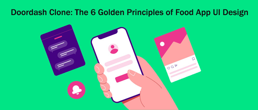
Have you ever wondered why you can use almost any app on your phone without Googling how? Thanks to the ever-evolving quality of user interface design, the user can skim through the app without any navigational and functional difficulties.
Here’s a quick guide to some of the most critical UI rules you should follow to create an attractive food delivery app. But first, let’s understand the difference between user interface and website user experience.
The user interface is how a digital platform looks and feels and determines how the user interacts. Although aesthetic appeal is vital, the psychological aspect of functionality over aesthetics is the main difference between UI/UX designs. As its name suggests, the user experience focuses on the entire experience, including why someone might be using the app and in what context.
Such design elements that induce a greater user experience appeal everywhere and are not product-centric. Meanwhile, the user interface design focuses on visual cues and follows the bedrock of a highly responsive and functional app. It can be as simple as tapping an icon over a long press for a different outcome.
"Hire Dedicated UI Designers in India"
Let’s Talk: uidesignroom@gmai.com
UI Design Room


The following rules are adopted from the book "Designing the User Interface: Strategies for Effective Human-Computer Interaction," written by Ben Shneiderman in 1986. These rules are followed by every top industry expert to design a platform in the modern era of on-demand applications.
No design rule reigns supreme over the needs of the user. A user-friendly app holds a grand promise for the business as it can be used practically. This includes using consistent colors, typography, images, and the placement of buttons across multiple screens.
Failing to do so will prevent the brand from being recognized. In contrast, an unsymmetrical navigation pattern can also frustrate the user. As a result, many new users will feel they are ordering food from a highly unprofessional place. That is why it is essential to pair clear-cut visual cues with textual cues to avoid ambiguity. For instance, use large icons such as arrows, crosses, and checkmarks instead of large chunks of text on a homepage menu to make navigation faster.
"Hire Qualified Freelance UI designers"
Let’s Talk: uidesignroom@gmai.com
UI Design Room
Have you ever accidentally closed the app while frantically looking for the back button? That is why it is essential to design a back button that is visible at every step of the ordering process. Nothing frustrates users more than being unsure of what is happening when they push a button.
For instance, shopping carts allow users to review everything before they checkout. This is a beneficial step to highlight any extra fees not accounted for in the initial cost.
The downside of being a digital nomad is that few people generally have the patience to learn anything new. So, a strict rule of thumb is to make the app interface as simple as possible. It should be devoid of any steps that give the user time to think about it, eventually deciding it is not worth the hassle. Therefore, you should always try to take as few steps as possible to get the maximum number of food orders.
"Hire Mobile, Web UI UX Designers India"
Let’s Talk: uidesignroom@gmai.com
UI Design Room
Think of meeting a person on the street. The first process is recognition, which you can efficiently perform. However, it isn't easy to identify the person's name, as you’d have to recall it from your memory to find the correct answer. The same applies to UI design, where you must provide as many visual cues as possible, like a search bar or a drop-down menu, to increase engagement between the app and the user.
Here, your customer may open your app after weeks or months. Hence, it is highly likely to presume recollection of every single button or icon. Instead, opt for visual cues, even the slightest bit of information, and avoid overloading your app with information that they have to deduce in the first place.
There should always be a hierarchy of information and design elements to provide a stable user interface on every screen. Skipping anything that doesn’t speak to the user and landing straight on the call-to-action might be unusual. As much as it is tempting to make the final “Place Order” button big and beautiful, you shouldn’t rush it. Instead, inform the user about their actions to maintain transparency.
For instance, ask the user to double-check the payment option before making the final payment. Below, you can include some text to elaborate on it in more detail. Make it attractive with a distinct design button, a different color, or a slightly different font.
"Hire Top UI/UX Designers in India"
Let’s Talk: uidesignroom@gmai.com
UI Design Room
Displaying clear error notifications and descriptive hints makes it easy for your customers to understand and resolve the problem if something goes wrong. A smart interface should be designed keeping in mind that if anything is stuck, your system should be prepared for it. The main reason is that people are naturally prone to making mistakes. Therefore, a smart user interface guides them on the right path instead of being non-responsive to their demands.
Whether it’s a wrong password or an unwanted item in the shopping cart, an effective app must be designed to be forgiving. Notifying the user of the error instead of shutting down the app is a rare trait that most delivery apps don’t possess.
Have you ever seen an app that looks crystal clear and attractive from top to bottom? You might. However, many apps don’t fall under the pretense of food delivery apps being incredible in the user interface. If you want proof, just check the review on the App or Play Store under any food delivery app. But this is not the place to complain but to give you the solution you need.
Behold the Doordash Clone! A UI specialist food ordering and delivery app engrained with countless features for people who want to start their own food delivery business. The biggest thought process behind the development of this app is to close the gap for people who cannot sustain the cost of creating a custom app.
"Top Freelance UI Designer for Hire"
Let’s Talk: uidesignroom@gmai.com
UI Design Room
You are not alone! The excitement surrounding a new app can frequently cause new entrepreneurs to believe they don't have any direct competition as their app is superior. Unless you've created a completely original product, there will already be a competitor in your niche with a larger market share. Hence, it is important that you keep this in mind and don't make the mistake of not conducting the necessary research to learn more about these businesses to set yourself apart.
Inquire about a free demo that you can test by connecting to a professional white-label firm. They will help you fill in the details you need to understand about the design and development of the Doordash Clone.
"Hire User Interface Designer On Contract"
Let’s Talk: uidesignroom@gmai.com
UI Design Room
Hiring an excellent super designer to craft a unique app for your business could be costly. However, if you are willing to invest in a clone app for your vision, Doordash Clone is the best option for your taste. Check the six rules mentioned above in every app you test and process with the one you find the best. Don’t waste months on design and development and enter an untapped market full of expansive opportunities.